LOGO&FONT
INSPIRATION

EXPERIMENT

FIRST TRYING
FIRST TRYING

FINAL
The original NEEC logo was mainly focused on the concept of incorporating keywords into the logo. So we respected their creative core and expanded some of our design elements. We have several different design concepts.
First, we can incorporate natural elements, using images of trees, leaves, water drops or the earth, because these elements can directly convey the theme of environmental protection and nature.
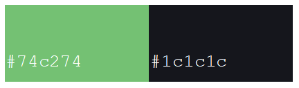
Secondly, use natural tones such as green, blue and brown, which can convey a sense of freshness, sustainability and eco-friendly.
Our concept is to convey sustainability and ecofriendly. Try to keep the design simple and clear so that it can be used in different media and sizes, including print and digital platforms.
#Process


FINAL
In terms of font selection, we initially tried to design based on the pattern on the original logo, hoping to keep it consistent with the brand's existing visual elements. However, in the actual application process, we found that although these self-created fonts were visually consistent
with the pattern, they failed to highlight their important position in the simple logo due to overly complex lines or lack of hierarchy.
This font design did not achieve the expected effect in terms of overall proportion and visual center of gravity, resulting in insufficient recognition and impact of the logo. After many evaluations
and discussions, we realized that although these fonts have a certain design aesthetic, in actual application, the fonts are not clear enough on the visual level, and thus cannot effectively attract the audience's attention.

This bold design gives the logo a stronger presence and allows it to stand out in a variety of environments.
By widening the font and reshaping the lines, we not only maintain the core identity of the original logo, but also bring a refreshing visual experience to the audience. This simple and direct design language effectively conveys NEEC's firm determination to protect the environment and achieve sustainable development.
When redesigning the NEEC logo, we cleverly integrated the original design elements and made some optimizations to enhance the visual impact. We chose a wider font style to emphasize the heaviness of the logo and text, making the overall design appear more concise and powerful.
Feedback

At the same time, we ensured the overall balance of tones and elements, so that the logo can express the theme of nature and eco-friendliness while maintaining the aesthetics and practicality of modern design.
This design strategy not only enhances brand recognition, but also strengthens the visual connection with the audience, giving people a clear impression that is easy to remember.