WEBSITE

WEBSITE

This is an adjustment based on the original website. Based on the original tone, some rigid colors and pictures are removed. And the green color in the main color is used to add a lively atmosphere.

FIRST

SECOND

THIRD

FOURTH

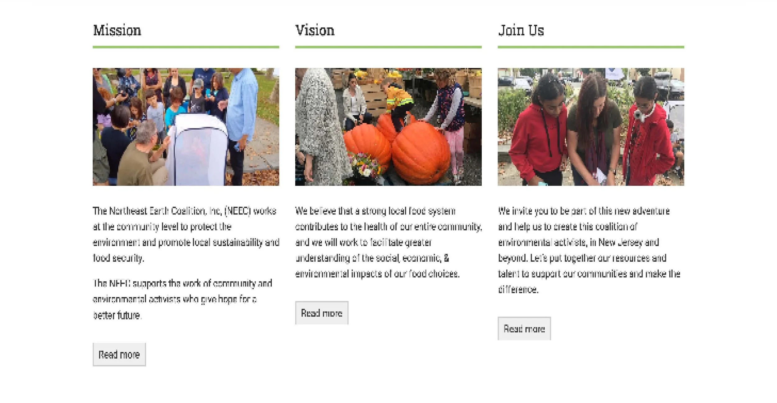
The second point is that on the “about” page, these large title texts cannot jump to detailed links and can only be expanded through the “read more” below. There is no way to highlight these three sections, so rearranging the buttons and adding links is our second step.

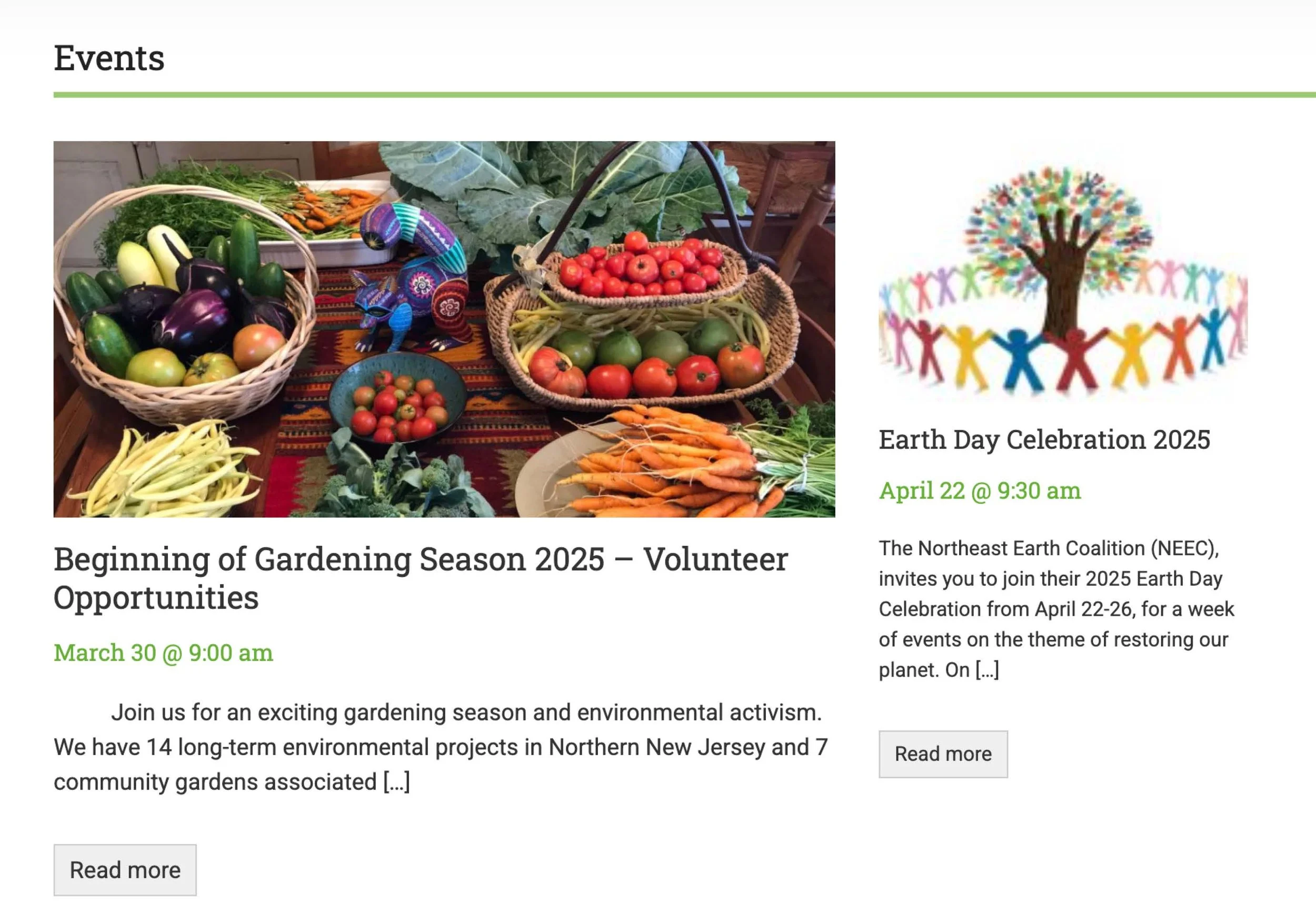
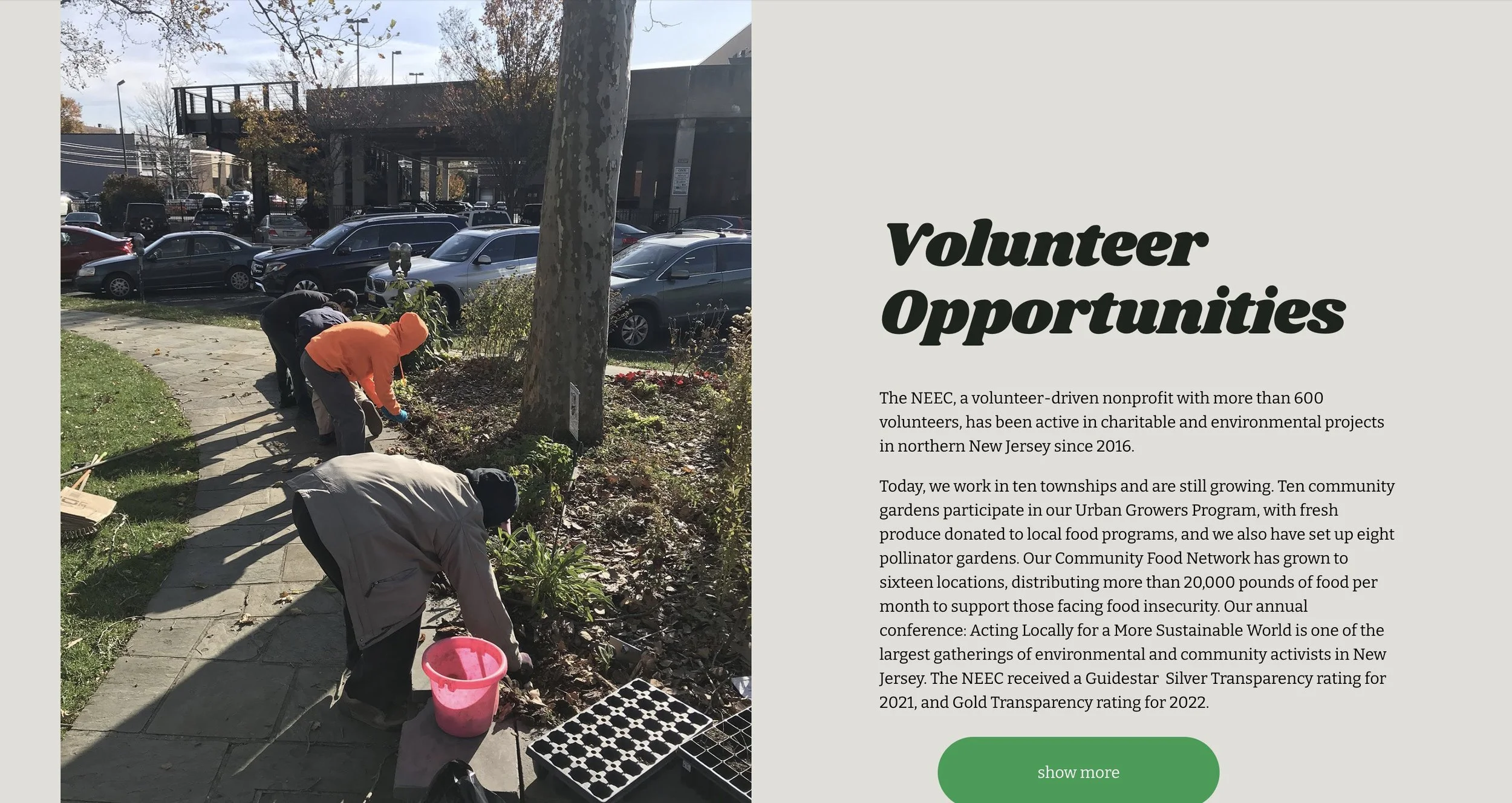
The original "event" button is not prominent in the entire website, so many people don't know what activities will happen next. So in our design, we will enlarge it and add it to the calendar to remind users.

When designing the NEEC website, we added a series of horizontal scrolling designs before the first image and the link at the end of the page, in which the words "NEEC" and "Join Us" are repeated. This design not only adds dynamic interest to the page, but also creates a sense of rhythm, making it easier for viewers to be attracted when browsing.

This constantly moving text effect breaks the limitations of traditional static design, captures the user's attention through visual changes, and prompts them to focus more on the page content. At the same time, this design cleverly strengthens the brand name "NEEC" and the call to action "Join Us". Through multiple repetitions, the brand message has the opportunity to leave a deep impression in the audience's mind, thereby increasing the brand's recognizability and memorability.

Adding the required buttons wasa flaw in their original websitewhere users couldn't quickly locate the page they needed and there was no login button.Scthis was a very necessary update.