
NEEC
Project1
Stratege&Identity
NON-CORPORATE IDENTITY
We redesigned websites, posters, stickers, logos and related screen printing products to convey the Northeast Earth Coalition (NEEC) to more audiences who have never known about it, by conveying the characteristics of sustainable development and eco-friendly, and expanding the brand's publicity and appeal.

INSPIRATION
Zenji runabashi is a famous Japanese painter known for his uniqueis artistic style, which often combines traditional Japanese elements with modern artistic expressions. This combination creates works that are culturally meaningful and visually appealing.


Funabashi's art is often characterized by soft colors and smooth lines, showing themes of nature, tranquility and harmony.
At the beginning of the project, we wanted to use such a simple and distinctive design idea in our poster design, and his work gave us a lot of inspiration-starting from the color direction

The way it is cut will also make the poster more interesting.


The style of web design is mainly simple and stylish, with many different patterns spliced together. Or the combination of retro tones and themes will also bring a different visual experience and a sense of history.

INTERVIEW
INTRO
Before producingthe output, we explored the popularity andinfluence of NEEc by interviewing people of different ages andsocial identities, The main purpose of the interview was tounderstand the current social perception of EEc and reflecton how to create unigue differentiation through redesign. Thefollowing are five different responses we collected from the on-site interviews:
AGE22
"I learned about NEEC when I attended anenvironmental protection forum at schoolTheir speeches were very inspiring. The schoolencourages us to actively participate in suchsocial activities,so I went to see theirwebsite. I rarely heard about it before."

AGE27
"To be honest,I haven't heard of NEEc before.I usually pay more attention to work and careerdevelopment-related information,and may notpay much attention to environmental protectioni community development.But I know otherandorganizations with the same purpose, and theyalso have content about non-profitcharitiessuch as environmental protection.、2.

AGE33
"I first heard about NEEC in the local marketthrough the various eco-friendly productsand sustainable living seminars they offer. Ithink if they can further expand these offlineactivities,especially focusingon parent-child activities,I can bring my children toparticipate,after all,this is also a very meaningful thing."
AGE45
"I first discovered NEEC on Instagram. Theirsocial media content is very attractive,especially the wonderful photos of animalsand plants and environmental tips. I thinkif they can add more interactive content,such as online challenges or registrationactivities,more people can be involved intheir environmental activities.Some of theweb pages are difficult to click and there isno strong promotion,so many people don't knowabout this organization."
AGE60
"I mainly know about NEEC through comunitybulletin boards and local news. I saw thatthey organized some elderly plant gardeningactivities, which are very suitable forseniors like us to participate. I hope theycan continue to develop these programsand strengthen cooperation with communityfacilities so that we can easily obtaininformation."relevant
CONCLUSION
Through this feedback, we realized the need for diversified strategies to increase NEEC awareness and engagement among different populations. The redesign direction will focus on strengthening online and offline interactions, enhancing experiential engagement, and providing tailored content and activities for different target groups.


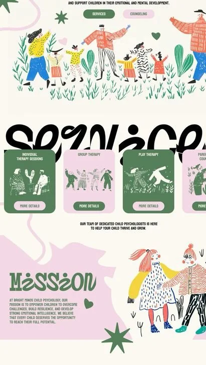
We established two different directions aimed at expanding the influence and communication effectiveness of NEEC. The first direction focuses on directly engaging the audience by usingnatural themes to build emotional connections. We chose to use bright colors to visually capture the audience's attention and spark their interest in the message we are conveying.
Coinciding with the nonprofit charity promoting their latest campaign, we decided to incorporate the idea of "every household growing their own fruits and vegetables." In this way, we aim not only to raise public awareness of the environmentand sustainable agriculture but also to encourage individuals and communities topartake in this simple,sustainable lifestyle.
During the design process,weintegrated various naturalelements,such as lush greenleaves and vibrant fruit patterns,to echo the theme of cultivatingpersonal fruit and vegetablegardens. we created visuallyappealing promotional materialsintending to convey a sustainablelifestyle that is accessible andactionable for everyone throughthis visual language. with thisinteractive and direct approach,wehope the audience feels invited toparticipate and thereby initiatepositive changes in their lives.
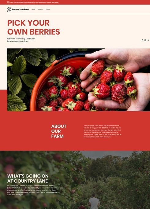
Different from before, in the design of the website, we intend to take "nature", "self-sufficiency" and "sustainable development" as the core concepts. Agricultural products are the main point to attract the audience, so that they will be more curious about "small farms".
Each image needs to contain the benefits of this non-profit charity, and visualizing the words will make it easier for the audience to understand.


Vibes
RESEARCH
Based on the analysis of theexisting websites, we feel that the publicity is far from enough. Only a small number of farmers and consumers know about this organization. However, not many people understand its benefits, so not many people will participate.For the benefits of self-sufficiency, we should adjust a page to describe the advantages it brings and tell the audience in tuitively


DIRECT
NATURAL
ATTRACTUIVE

We wanted to change the website to
present a direct approach and draw up a flow chart to explain why the benefits exist.
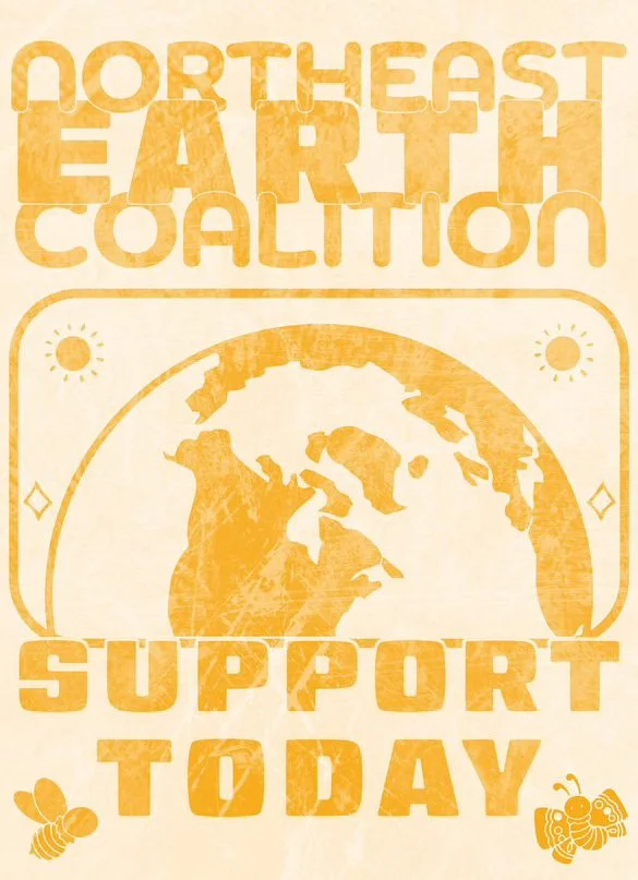
LOGO&FONT
Our main goal is to increase awareness and attract differentaudiences through different output methods .After changing thedesign style, differentvisual experiences can be generated.
WEBSITE
LOGO&FONT
Because it is an environmental protection organization,we plan touse a more rounded font toreduce a lot of sharp edges.
For the logo design,we planto use simple black andgreen tones to highlight the concept of the environmental protection organization.
PRINT PRODUCT
If you want to spread theword about a non-profitcharity,you must havedifferent design outputsso that the audience canunderstand the organizationfrom different angles. simpletwo-color printing can dothis.
STICKERS


EXHIBITION
WEBSITE
The website is also anessential part.The originalwebsite design is not strongand does not attract theaudience when browsing.
Based on the originalinformation,we plan to addsome interactive icons. ndthe guidance will be moreperfect.
STICKERS
We have short sleeves andhandbags for young people,but this organization is notjust for these age groups,we even need to ace the newgeneration of teenagers,socolorfulstickers are also a goodchoice.while achieving novelpatterns,we can alsoextend the age range,whichalso expands the publicityefforts.
MINDMAP


T SHIRT
POSTERS
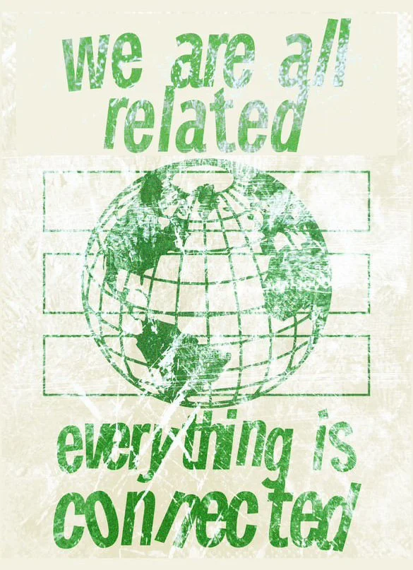
During the initial research phase ofthe project,we explored and collectedmany poster design inspirations toensure that the final presentationwould convey NEEC's core values andegoals in a diverse manner. Initiallywe considered acombination ofdifferent styles and aesthetics to meetand attract adiverse audience.


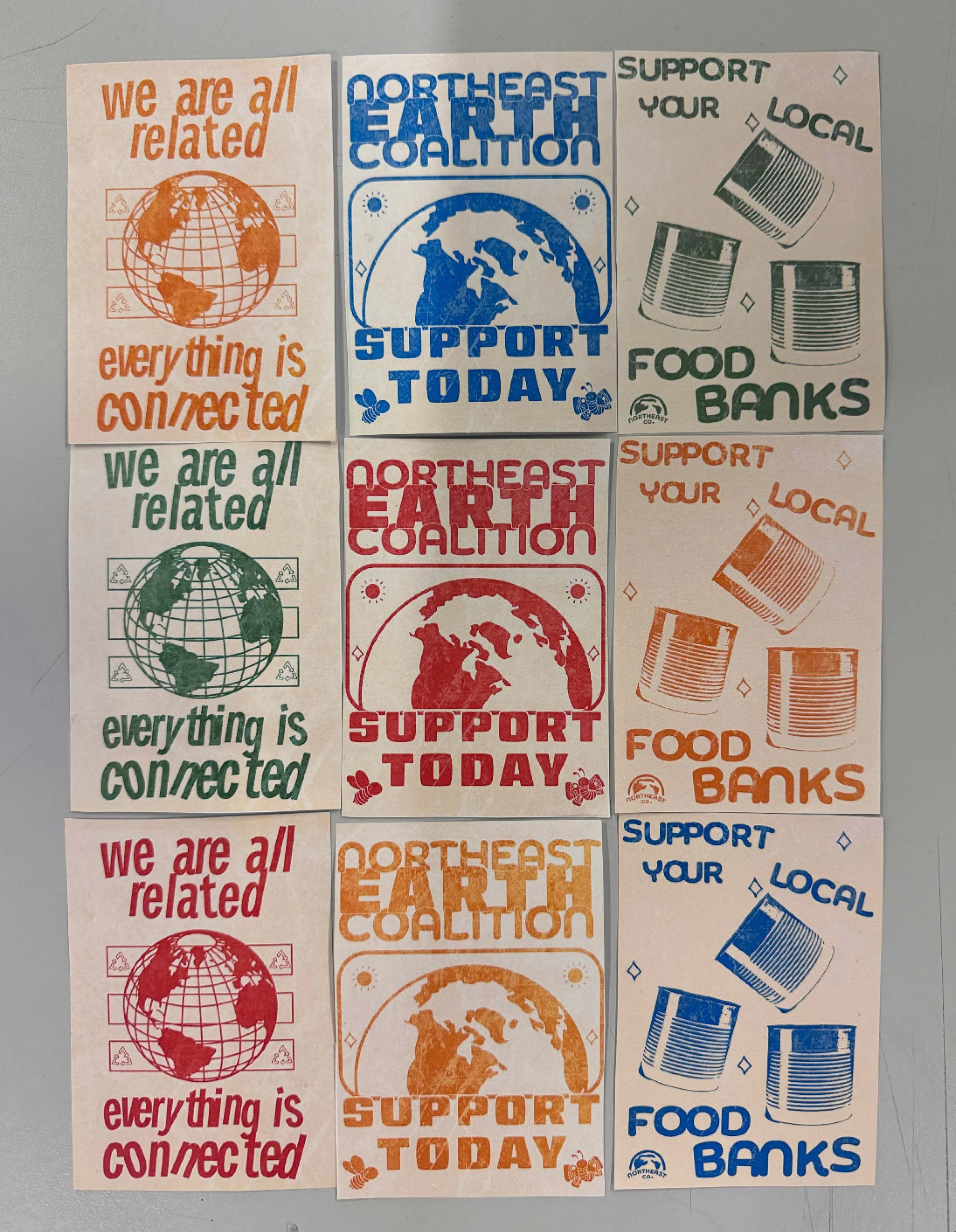

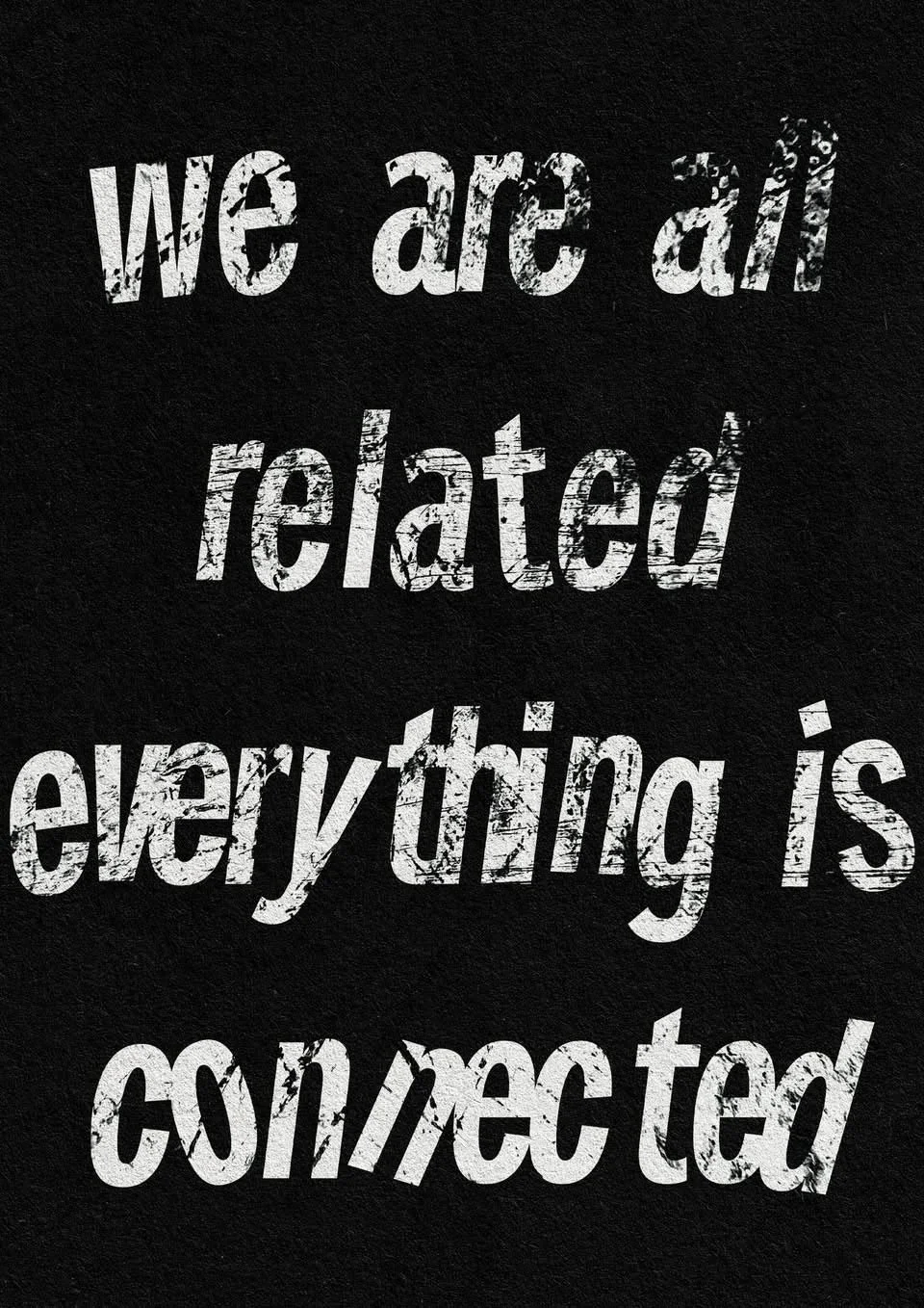
We made a series of posters based on the theme of "Family Farm", mainly drawing some pictures about farm products, and adding some simple text and logos to introduce the details.


SECOND
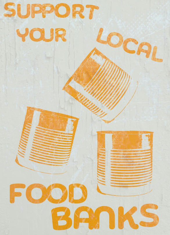
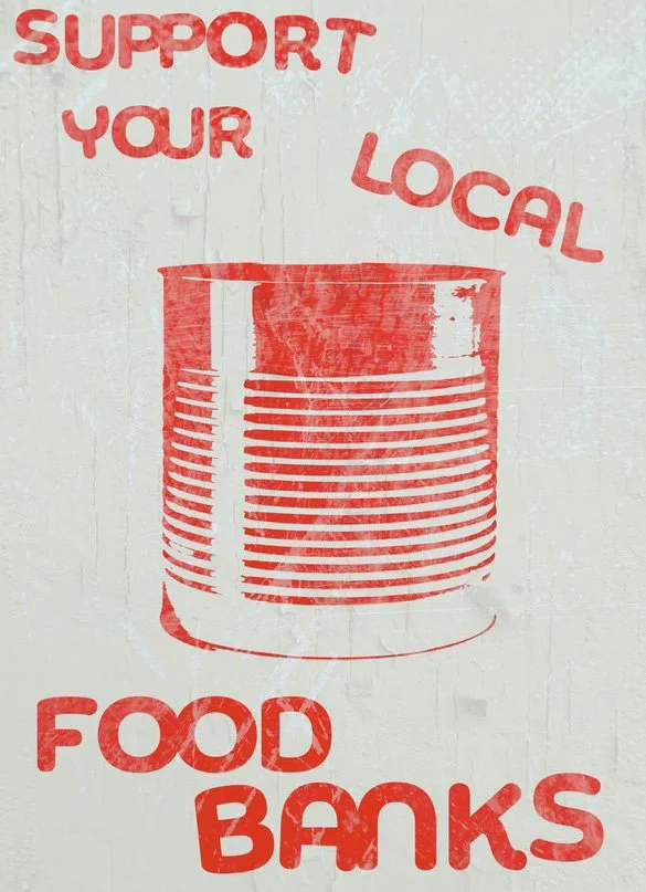
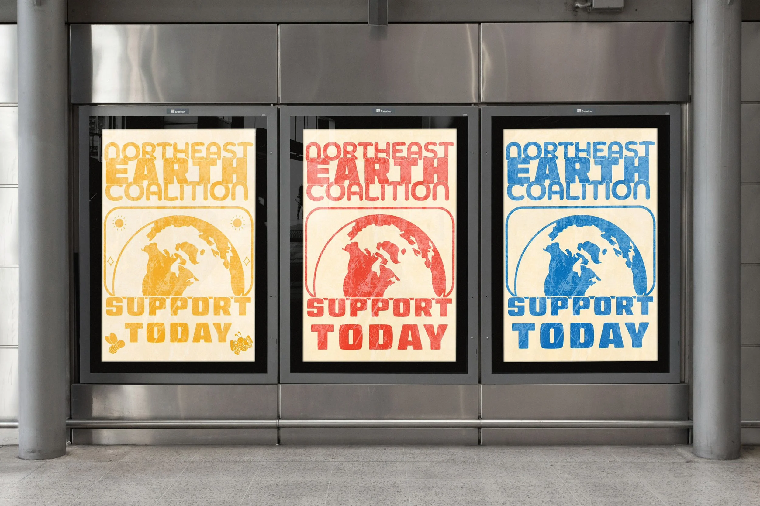
Our team members used different sustainable materials, such as aluminum cans, and NEEC's logo and slogan to make posters.
FIRST

THIRD
TEST

Finally,we put all the posterstogether into an exhibition,which not only arranged different color combinations but also created a strong visual impacton the audience,attracting them to learn more details.
Later in the project,we plan to launch a variety of poster styles to increase the visual impact and breadth of information dissemination.
These designs include retro-style posters,which will usenostalgic elements and warm colors to evoke emotional resonance in the audience through this classic style.
We simulated and experimented with placingposters in many different areas as exhibitionsor in public places to attract the attentionof passers-by and tourists. Improving thevisual effect can increase their appeal andhelp people understand the organization.

OPEN STUDIO


FEEDBACK

After the open studio event,we collecteddifferentfeedbackfrom multiple groups.Thefeedback covered many aspects,such as whether thecontentwas successfully conveyed andwhether different materials wereeffectively used for display.These questions not only helpedus evaluate the effectivenessthe design,but also played arole of reflection,allowing usto have a deeper understandingof the audience's views and expectations.
After seeing our work,theaudience made some valuablesuggestions,which was crucialfor our subsequent adjustmentsand improvements.Some viewerspointed out that the expressionof some design elements was notclear enough,resulting in poorinformation communication.Thismade us realize that in somecases,overly complex designs mayobscure the core information.Therefore,we decided to simplifysome elements toensure that theinformation can be conveyed tothe audience more directly andclearly.

SELF-FEEDBACK
The feedback mentioned that the audience also gave positive commentson the use of different materials. Someviewers mentioned that using differentmaterials and printing techniques canenhance the touch and visual appeal ofthe work. Therefore, we also rethoughtthe flexibility in material selection tobetter support the visual language ofour brand.
In this unit,I can feel that it isnot easy to be a group collaborationproject,because most of the time, weneed three people to work together tosolve the problems that arise. Whenthere are disagreements, we also needto adiust to the best state. Whendiscussing the design of stickers, wehope to show as many rich colors aspossible, but our team member wanted topresent a retro tone. In the end, wechose his suggestion. Group discussionwas the most difficult step.
Later, after the failure of the initialexperiment with short sleeves, we beganto look for a new way of presentation.After active discussion and division oflabor, we also made great progress.

REALIZATION
&MOVING FORWARD
SUCCESS
For us, the success of the projectdepends on whether we can make theorganization more known to morepeople. or whether our design ismore promotional and appealing thanthe previous design, and whether thevisual efect is stronger than the oldwebsite, In the end, we feel that aftera series of redesigns, the visualefect has been greatly improved.
For me, this design is a brand newbeginning, and it can be said that Istepped out of my comfort zone. whatis diferent from the past is thatthis time I started to try a lot ofoutputs that I had not done before.For example,I have been trying to doexhibitions before, and I want thefinal visual efect to be relativelylarge. But this time I found that manyof them could not fully express ourdesign concept. Instead, we respectedthe original rules and only changedthe insuficient parts, which wouldalso have a good efect. so in thisdesign,I added web design,which isan area I have never tried before, andI also found a lot of fun from it.
INSUFFICIENT

After experiencing these challengesI realized that it is necessary toclarify the goals at the beginningof the design and quickly developa clear design roadmap. This willhelp save time on key decisions andallow us to focus on more creativeexploration and detail polishing.To achieve these goals, I planto explore diferent designlanguages and expressions,such ascombining tradition with modernity,or expressing cross-culturalperspectives. In addition,I alsoplan to use technology to enhancethe interactivity and immersion ofthe work, so that the audience cannot only watch passively,but alsoparticipate and experience.